Tuesday 15 December 2009

Textual Analysis of the Music Double Paging

The setting of the magazine is based on under a motor way or car parking lot building or gigantic roads. Also, the main place is actually set in the city, where there are tons of people living in the city, and the city has also a gangster territories or teenager hideouts, such as under the motorway, and a car parking lot as a secret hideout. This connotes to the theme of rocking roll music, or using it to be as example of rocking roll teenagers.

The lighting in the image is interesting because, the lighting is shinnying on the singer. Given the image to have high key tone of lighting on the singer, to represent the singer as the main figure of the double paging, with the surroundings of the low key tone of lighting.

Also, as we know there are different combine images in the double paging, and they are mostly black and white photos. It does contain text, and with a poster with a different completely colour, comparing with the black and white theme. However, the costumes for the people are wearing of the double paging is using teenager or gangster clothes to connotes with the theme of a rocking roll or teenager type of song.

Whereas there, are some few of props used in the main image, which were audio or musical technology, such as the audio machine, microphone, and a guitars used for the theme. However the main theme of the double paging, is should be rocking roll or teenager music, therefore the props supports to connote with the theme.

Non-verbal communication were used in the magazine for the four small images of the people looking towards the audience or the readers, therefore this connotes towards the facial expression of showing they are cool, they really want do some rocking roll, one of the images is sexy to attract woman.

Technical Codes of the double paging magazine

1. Shot size = Long shot, and wide shots

2. Camera angle = mostly high angle

3. Lens type = Wide angle, and standard angle

4. Composition = Using only asymmetrical

5. Focus = Using harsh and soft

6. Colour = The colours are used to connotes with theme of rocking roll for darkness, however the orange image does goes with the theme for rocking roll for death for the magazine.

There has been different Font types to feature the text, such as for subtitles, and the main title is huge in the magazine, because “KILL ‘EM ALL” to connotes as the main subject of the double paging and the theme. Whereas for the other text is just for some information about what type of music, or the people who are playing the music.

Finally the Anchorage used in the magazine, is the author uses graphics method to support making the images to gather many readers as possible, and using the style of texts used and sometimes being changed to support the information or to connote about the theme or what is exactly about.

Textual Analysis of the Music Front Cover


This is a front cover of a music magazine; the setting for the magazine is based on a white mysterious place, to connote with the theme of cloudy rocking roll place.
There are some props used in the magazine, such as a small image of a rock star carrying a guitar to connote with the theme of music rock.

There are some lighting used in the magazine, such as there is a very high key tune lighting surroundings of the large three figures , because it is to connote as the main subject for the front cover about the rock stars, even other few images where involved as real to represent in the magazine.

The whole magazine contains non-verbal communication because they have nearly the same facial expressions to each other. This connotes with the theme of showing these people, they really want to rock, as they shown from the magazine.

Technical Codes

1. Shot size = Medium long shot for the background, close up for the four mini images in one, mid shot for the two images, such as person standing, and another person with a guitar.
2. Camera angle = Mostly low angle shot
3. Lens type = Only Standard angle
4. Composition = using only symmetrical
5. Colour = Using different range of colours, while changing some of the colour effects, this is to connotes with theme of natural colours for any type of music.

Anchorage of the magazine contains the text, graphics, and image, to get attracted with audience or the readers to show the design about the information of rocking roll because the colouring is great, with the support of the graphics. While the image is more attracted to get people, of what are people doing in the magazine.

Finally there some different font types being formatted in the magazine, such as the mini format text been used in the bottom left with two different colours to represent separate information. However the rest of the text is different, and also the heading ROCK SOUND is connote to represent as the main subject of the music rock magazine to bring good headlines for the audience.

Music Magazine Introduction

This is a project for Media coursework about the Music magazine, and the main objective for the project is to design a Music magazine. However, before making the Music magazine I must do some research, and doing drafts, this would lead towards the final design of the music magazine.

Monday 7 December 2009

Evaluation


In what ways does you media product use, develop or challenge forms and conventions of real media products?

Well I made something more original which broke with the conventions of the past than other magazines, because the terms of design I used was making the title more different, such as the main big heading CTK with small words of CTK Sixth form. Also with a small heading under the main heading. Whereas I used mode of address, to cause the young students to get attracted, they might interested to have a look at it, because the way I use the design. Finally with the use imagery to show a student working in a college, it brings the effect with other college students, which we are equal and even to each other. This is an example of a media product use ,such as the masthead. Then use some part of the ideas and put it on my own magazine.


How does your media product represent particular social groups?

First, the sense of reality I have constructed in my representation, is trying to get in a correct place of what is based on my drafts. Therefore I showed a students wearing different clothes, and using props of something smart. However my front page of the magazine includes one student wearing something smart, such as a black jacket or blazer with a white T-shirt. While he is holding one props, which is a green folder to connotation for to represent the young students studying for the subculture education of the college.


Whereas for the context page, it contains two images of normal two students with little bit smartness dressed, but it still makes them as normal students wearing different clothes, also the both images contains props of a book called sociology, and a green folder. Plus I arrange models for the first photo of the left side about two students chating about their learing from a folder or explaining them. Whereas for other photo, it conatins a student acting as reading a book. Therefore all of the photos represents or to connotaion for the education of learning in a college.

How did attract/address your audience?

I use features, cover lines, and photography designs for the both pages to get the audience attracted by conducting a survey or questionaire, so I can use the results from the questionaire to get a good designs of the magazine. Also the way I use the normal English language for the magazine, because it is expected to be a college magazine, so people can understand clearly, instead of using the language of street slang. Plus, the place I photographed is at the outside and inside of the College, because it is the correct particular area to match with the magazine. Even, I used the fonts ideas from the questionaire, therefore I used purple with good graphic style.

Finally the way I positioned of the photographs, is finding the people who can be as a model for the role of the college magazine. Therefore I get the people to wear normal oridnary clothes with bit smartness, and acting as a normal people carrying education props, and chatting in the college. This relates with the people or the theme of the audience, who goes to the college, and could be possible to attract the people or students in the society.

What have you learnt about technologies from the process of constructing this product?

The only programs I used, is Adobe Photoshop because it is great programming of design speacial images with fantastic graphics to help with my college magazine designs. The termilological tools I used for my designs of the college magazine, first I sort out the images brightness using the adjustment to sort out the contrast and brightness to change the way I wanted to be. Then I use the polygonal, and magnetic lasso tool to choose the area of the image I want to select, then changed, when I find out, my first image of the boy wearing a ordinary T-shirt with a black blaza on top. Therefore I select the whole area of the T-shirt and change colour completely into white colour to make it more like a smart shirt with black blaza on top. Even I used this tool for to change the style of the grass background into brush style, and for the text, I use the type tool to choose of where I want to write the text. Then I change the style of the writing into purple and large, even the background of the text is different, because I use the blending options for layer style of the text. Finally if I want to put the media componets together, I grouped them or link them as layers.

Whereas I used the same plainning together for my contents page, however I made the background white, and bright. Even the big Christ cross is been shaped in the middle of the page, However there is also a mini version in the top right corner of each pages. Finally for the front page I add and paste from google of a bar code to attach with my magazine design.

Audience Feedback

Well first of, I got only one audience person to have a look at my magazine results as a tester, therefore I given the person a questions for to answer.

1. Comment on the Front Cover : Good background photo, the words are layed out in a sensible fashion. The font could use a bit more detail.

2. Comment on the Contents Page : Images are relivent, nice font layout, but the background needs some colour!!!

3. Do you agree or disagree, that the college magazine is a good designed? : I agree in some context that this magazine is of good quality.

4. Do you like the images, which shown on the magazines? : Yeah, brilliant!

5. Do you like the way the text is used in the magazines? : The layouts fine on both pages.

6. Do you like the way the media components are used in the magazine? : I’m afraid the images have nothing to do with the text, so maybe you could move them to a place where they will.

The weakness I can spot from the result is that the contents page needs more colour, and getting the images to be linked with the relationship of the text. The Stengths I can spot is the layout is fine, and good quality. Also the background images and text are sensible fashionable. Finally I agree witht the audience or a person comments of my magazine, however I'am not very sure if I could agree about the relationship between the image and the text.

Monday 30 November 2009

College Magazine Final Designs


This is my college magazines front cover, and context page, and it's nearly looks like, based on my drafts, because I have to improve some changes a bit to get it right, more better than the drafts.

Monday 9 November 2009

Chosen Two Pictures For Front Cover And Context Page


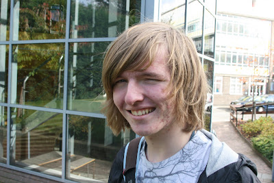
This images will be the part of the context page because I know I got a blank page with the big cross and text, so I decided to add the images to the page.


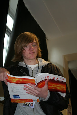
This is the picture I might use for the front cover, and it is based on the draft.


Thursday 5 November 2009

Monday 2 November 2009

Photo's Preparation


These are the photo's I took, and I have to choose which photo's should it be for each two page (Front Cover, Context Page). First three pictures, will be choose one of them for the context. While the other pictures, will choose one of them to be part of the front cover.


Monday 19 October 2009

College Magazine Draft: Contexts Page

This is my first draft of context page with six paragraphs and a background picture with the heading. Theres a problem with the text with the background, and doesn't look good together, there will be changes to improve it.


This is my second draft of improving my context page, by get rid of the background picture and replace with a just ordinary colour background.

This is my new improvement draft of my context page with colour and font. The background of the context page, and I have get rid of the picture and replace it with a big brown holy cross with white colour background.


College Magazine Draft: Front Covers


This is my first draft of the college magazine, and I need to improve this image because the mistakes is there's writing covering the background persons face, and the background needs improvement.


This is my second draft of the college magazine, and there has been changes of the draft because the background has been improved. Even the text is no longer in the persons face.


This is my new improvement draft with nice colourful colours by using the program Paint to design the colours of the draft as prediction of a picture in the future design of my college magazine

Thursday 15 October 2009

Audience Research

This is the first question of the questionnaire, and it is useful for to know if people wanted to read the magazine. As results from the graph, most people want to read a college magazine, and so I will make a college magazine for the people to read.

Do you want to read a college magazine?
Yes- 15
No- 5

This is the next question about what type of gender, and how much are they, so as results, I have to make sure there’s an info magazine for more women, and some men. It is useful for to help me, of what gender does the magazine should attract to.


What gender are you?
Male- 9
Female- 11


This is the next question, about what colour should the heading be. However it is useful for to get people help me to choose a colour, and most people wanted a blue heading, even the text colour does follow the heading colour.
What colour should the heading be?
Purple- 4
Dark Blue- 4
Violet- 1
Red- 2
Blue- 7
Yellow- 1
Green- 1
Other- 1
This is the next question, about what age are you? This is for to know, and help me what age of people I’m aiming at. As result, and my target is the people of aged 16.

What age are you?
Age 16- 14
Age 17- 4
Age 18- 2


Next question is which one of the background pictures should be on the front cover. This question it is suitable for to help me of choosing the picture for the front cover, and as result it is the front building picture for the front cover.

Which one of the background pictures should be on the front cover?
Front Building- 9
Back Building- 1
Giant Cross- 2
Library- 1
Sports Hall- 3
Chaplaincy- 2
Café-2
Next question is how many paragraphs it should contain. This question it is useful for to know how much information should it be on the front cover, and as result many people wanted about between 4-6 paragraphs.

How many paragraphs should it contain?
1-3 paragraphs- 8
4-6 paragraphs- 12

Next question, how much should it cost for the magazine, it is useful to know the cost, because the more people who wanted cheap magazines, the more they buy it. As results most people wanted 1.50 pound for a magazine.
How much should it cost?
£1.50- 17
£2.00- 3
£2.50- 0
Last question, which type of information should be in the magazine. This is a useful information about which type of information should it be on the magazine for to get peoples attention, and as result most people wanted a news information for the magazine.


Which information should be in the magazine?
Sports- 9
Culture- 4
Music- 10
Religion- 4
News- 13

Most people will like to read a magazine, even most girls, and few boys wanted to read a magazine, and most people in the questionnaire are age 16. The plans of making the magazine are adding the blue heading and text. The picture which should be in the front cover is the front building of the college, and at least include about 4-6 paragraphs. The cost of magazine will be about £1.50, and the most people wanted news information for the magazine.


Textual Analysis

The setting of the magazine is based inside the college’s science lab, because the science equipment was included in the picture. The connotations behind the image are that students take learning seriously, and are very focussed. We can see this from the way the girl is focussed on her work in the image. The setting of the image tells us that the college is a serious place to study.


Although the person in the image is not looking at the reader, her body is facing the reader, which shows friendly body language. Her facial expressions show she is interested in her subject, making the image appealing. The connotations behind the facial expressions are that she very focused, but also with a smile she enjoys her studying.

The lighting for the image is quite simple, and it is lit from the front, we know because of the reflection on her glasses and the lighter areas of her chest and face. The background is grey and flat, which is a contrast to her figure. The connotations behind the low-key lighting are that the girl has more lighting than dark background as main point of the person studying of the college.

There is no real costume used in the image as the person is wearing ordinary clothes as a student would. The connotations behind this costume are that a student wearing non white clothes or science protection clothes seriously in the college.

The Font type used for this front cover is a Sans serif font. The word “Beloit” is used as the masthead and the font used is modern in style. However there are some different types of separate fonts in the magazine.

There are some props used in the image such as science equipment with chemicals and glass goggles. This is to represent as a science lesson in the college. The person in the image is not wearing a traditional white coat, like scientist normally do but wearing casual clothes, which makes the image more attractive to students. The connotations behind the props are that seriously well lab equipment.
The Anchorage for this picture has included different text, font sizes, graphics and image. They all combine together to create the meaning about the college to attract peoples attention to go to the college. Even showing how serious the college is.
The technical codes used for to create the image by shot size of top of the person without seeing her legs. Camera angels were aiming front of her, but the part of arm is missing. Also the lens is standard, good focus and different colours. The connotations of different colours are that there’s bright colour pink and the girl’s skin is than the dark colours in the background, which represents how she works seriously in her study.

Introduction

This is my Media blogger, I will be posting my A-level courseworks, and my first objective of the coursework is designing my project of my college magazine. Therefore I will start of my tasks, which is to make a Magazine cover, and context page.

First thing for courseworks of designing Media magazine projects is doing Audience Research, to gathering the information of what people want. Then design the drafts and scan it to the computer. Next desing the actual proper or non draft magazine as a final thing for the design of the first coursework.

Even after this coursework, it will be another coursework to do in the future next.......